Checkout Abandonment Reasons: 8 Causes and Fixes for 2026
By Arthur Falcone · Founder of Arlo
A shopper adds a product, enters an email address, reaches payment, and disappears. Your analytics show a sharp drop at checkout, but they don't explain whether the buyer rejected the shipping cost, couldn't complete a payment, lost trust, or hit a broken field. That uncertainty makes founders reach for broad discounts when the actual leak may be a single step.
Most checkout losses come from a small set of recurring problems. The practical challenge is separating UX, technical, pricing, payment, trust, shipping, mobile, and expectation gaps in your own store. The eight checkout abandonment reasons below are ranked by likely revenue impact for Shopify and DTC operators. Each one includes the signal to look for before changing the experience, the diagnosis that confirms it, and a fix you can ship without guessing.
For broader recovery tactics, see this guide to how to cut cart abandonment. Start with the reason that matches your data, not the reason that appears most often in a generic list.
#Table of Contents
- 1. Unexpected Extra Costs at Checkout
- 2. Forced Account Creation
- 3. Slow or Unclear Delivery Timelines
- 4. Payment Trust and Security Concerns
- 5. Long or Complicated Checkout Process
- 6. Limited Payment Options
- 7. Technical Errors and Mobile Checkout Friction
- 8. Unclear Returns Policy and Lack of Guarantees
- 8-Point Checkout Abandonment Comparison
- Turn the Diagnosis Into Your Next Checkout Sprint
#1. Unexpected Extra Costs at Checkout
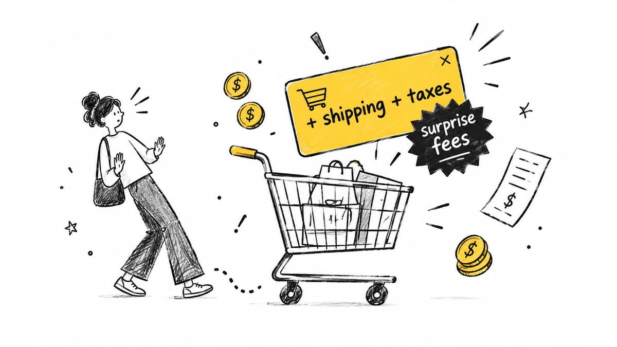
Unexpected shipping, tax, handling, insurance, or duty charges are usually the highest-impact pricing leak. In a February 2024 Baymard survey of 1,012 U.S. adults who had abandoned an online cart, 48% said shipping, taxes, or other fees were too high. A separate 2024 global survey found that delivery fees caused abandonment for approximately 41% of online shoppers, while 30% cited unexpected checkout costs or finding the same products cheaper elsewhere. The eMarketer summary links these figures to a basic trust problem. Buyers may accept a known fee, but they reassess when the total changes late.
#Diagnose the price reveal before changing it
Check whether exits cluster immediately after the shipping-rate display, tax calculation, or fee disclosure. Segment the result by cart value, destination, and shipping zone. A high exit rate on low-value carts points toward an economic mismatch, while a spike after an international address often indicates duties or delivery rules.
Keep shipping too expensive separate from unexpected costs in your analytics. The first may require a fulfillment or margin decision. The second may only require earlier disclosure. Show estimated shipping and tax on product pages or in the cart drawer, then keep the projected total consistent through payment.
Practical rule: A known cost is easier to evaluate than a late surprise.
Test a flat shipping rate against a free-shipping threshold. A threshold can encourage a larger basket, but it can also frustrate shoppers whose order is just below it. Add a cart progress bar only when the threshold makes commercial sense, and review your gateway economics with this breakdown of payment gateway fees. Use Arlo's weekly report to check whether abandonment rises after shipping or fee changes.
#2. Forced Account Creation
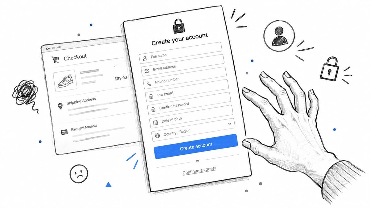
A shopper who wants a one-time purchase shouldn't have to create another password before paying. In Baymard-based research summarized by RetailWire, 25% of U.S. online shoppers who abandoned checkout objected to creating an account. Another reported breakdown cites mandatory registration at 26%, so the exact result varies by survey design, but the operational conclusion is stable. RetailWire's checkout discussion places account creation alongside other measurable checkout barriers.
#Confirm the account wall in your funnel
Compare completion for guest sessions and account-required sessions, if both exist. If you currently force registration, look for a concentrated exit immediately before the registration form or after the password requirement. Track whether the email field is completed before abandonment, because guest shoppers can still be reachable without creating a customer account.
Put Continue as guest in the most visible position. Offer account creation after purchase on the confirmation page, using the email and address the customer has already entered. The benefit should be concrete, such as order tracking or faster future checkout, not a vague invitation to “join.”
Shopify's guest flow and Shop Pay can serve different jobs. Guest checkout removes the initial commitment, while Shop Pay can accelerate returning customers who already want a saved-payment experience. For subscription brands, require an account only where it supports an actual function, such as managing an active subscription.
Collect the email early, explain why it's needed, and keep recovery messages available to guests. Then compare completion, customer-record creation, repeat purchase behavior, and support contacts. A registration increase isn't useful if it comes with fewer completed first orders.
#3. Slow or Unclear Delivery Timelines
Delivery uncertainty becomes expensive when the product is time-sensitive. A gift buyer, event attendee, or replacement-purchase customer may abandon even when the product price is acceptable if the store won't state when the package should arrive. Baymard-based research reports that 24% of abandoning U.S. shoppers said delivery was too slow, and the 2025 U.S. survey reports the same issue for 21%. The Statista summary also treats delivery as a distinct friction from extra cost.

#Diagnose the promise, not just the carrier
Compare checkout exits for shoppers who view delivery options with exits from shoppers who don't reach that step. Then compare promised dates with actual carrier performance and support contacts. If cancellations or complaints cluster around one service level, the problem may be an unrealistic promise rather than a slow checkout.
Show a specific delivery range on the product page and in the cart. “Ships soon” doesn't answer the buyer's question. A postcode-based estimate is stronger because it accounts for destination, stock location, and the selected service.
Use a realistic dispatch time, and offer at least one paid expedited option when the economics work. A paid option can preserve the order for a time-sensitive shopper, but it won't help if the standard promise is unclear. Display the cutoff only when your warehouse can meet it consistently.
Delivery speed is part of the product offer. If the date matters, show it before the buyer reaches payment.
Track complaints by SKU, destination, carrier, and promised service. Don't shorten the stated timeline to improve conversion if your operation can't deliver it. Missed promises create refunds, chargebacks, and negative reviews, which can cost more than the original abandoned order.
#4. Payment Trust and Security Concerns
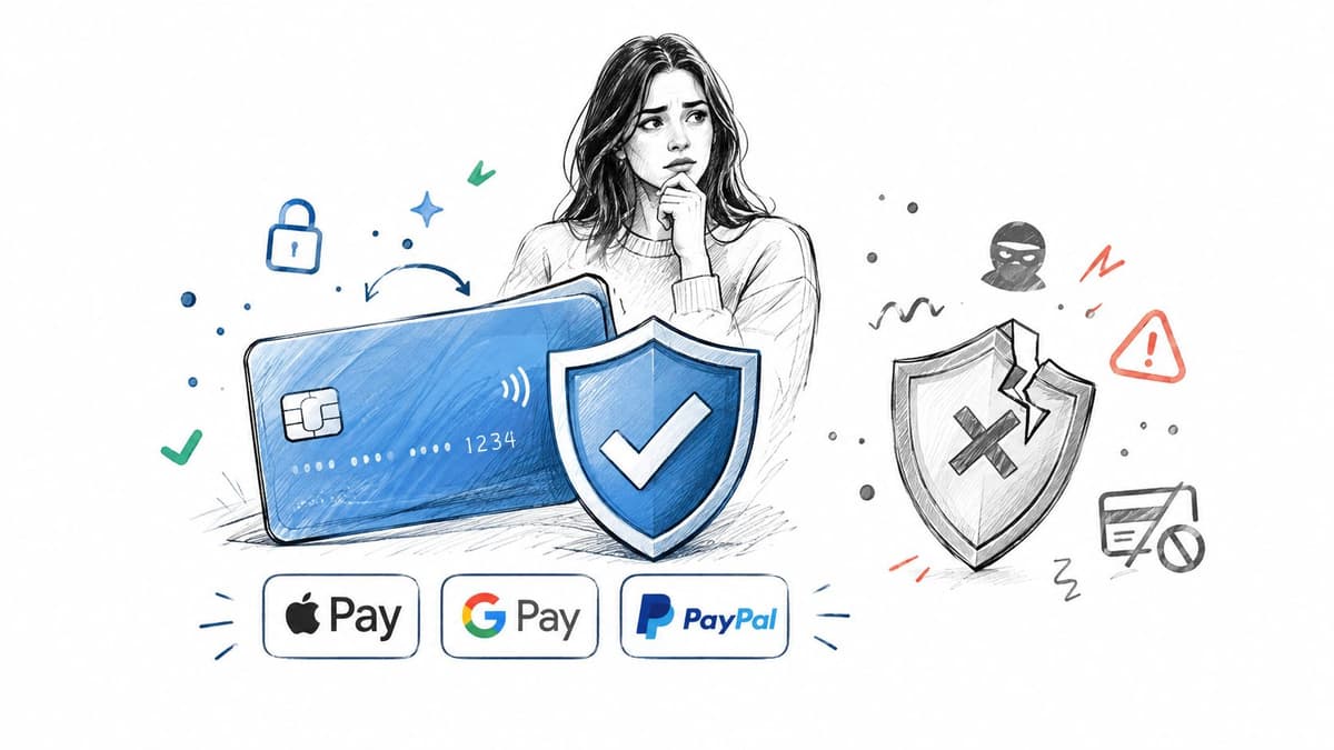
Some shoppers leave because they don't trust the store with their card details. Baymard research summarized by RetailWire found that 19% of abandoning U.S. shoppers lacked trust in the site with their credit-card information. That concern is especially strong for unfamiliar brands, unusual domains, inconsistent branding, or payment forms that look disconnected from the store.
#Find the trust signal that is missing
Look for payment-step exits among first-time visitors, then compare them with returning customers. Session recordings can reveal hesitation around the card form, repeated clicks on security links, or exits after a redirect to an unfamiliar processor. Also check whether the checkout domain, logo, and visual language change at the moment of payment.
Place recognized payment logos and a short security message beside the payment fields. Keep the checkout on the same domain and visual system where possible. Make sure HTTPS and a valid certificate work across every page, not only the final checkout route.
Customer reviews, a satisfaction guarantee, and a clear support contact can reduce uncertainty for new visitors, but don't cover a weak payment experience with badges. The trust cue must support a working, understandable checkout. For Shopify stores, a familiar Shopify Checkout flow can reduce the shock of a third-party redirect.
Review your dispute and fraud process as well. RDR and Ethoca alerts for Shopify are relevant to chargeback operations, but prevention starts with a payment experience that looks legitimate and explains what happens next.
#5. Long or Complicated Checkout Process
A checkout can be technically correct and still ask too much from the buyer. Baymard reports that 18% of U.S. shoppers who abandoned checkout found the process too long or complicated. Its large-scale checkout benchmark found that 64% of more than 180 leading ecommerce sites had mediocre or worse checkout UX. Baymard's checkout usability research also identifies field-level defects, including unnecessary phone requirements and difficult expiration-date entry.
#Diagnose the field that creates the exit
Track field-level validation errors, time between fields, back-button events, autofill success, and payment-button render failures. A high drop-off after address entry doesn't prove the address form is the problem, but repeated corrections or long pauses there make it a strong suspect.
Audit every field. Remove anything that isn't required for fulfillment, tax, fraud prevention, or compliance. Enable browser autofill and address autocomplete, use the correct mobile input types, and explain mandatory fields inline. Error messages should state what went wrong and how to correct it.
For multi-step checkouts, show a progress indicator and preserve entered data when the shopper moves backward. A single-page layout can work well for a short form, but it isn't automatically better if it creates a dense mobile screen. Test completion by device, browser, and returning-customer status.
Review the store's customer digital journey before changing the form. The right fix may be a removed field, clearer validation, or a payment button that failed to render, not a complete checkout redesign.
#6. Limited Payment Options
A shopper can reach the final step, find no familiar way to pay, and leave without reporting a technical error. Payment choice affects completion differently by market, device, and order value. WooCommerce's checkout trends found that, among shoppers who abandoned because of checkout or payment issues, 28% cited failed transactions, 21% cited too many steps, and 21% cited the inability to use a preferred payment method. These signals require separate fixes.
#Compare method availability with abandonment
Rank this issue by estimated revenue impact before changing the payment mix. Export checkout completion by payment method, geography, device, and order value. A high exit rate after method selection points toward gateway or decline problems. Strong traffic to the payment step with little method selection suggests a missing wallet or local option.
Enable Apple Pay and Google Pay, and show express buttons on product pages and in the cart when the platform supports them. For higher-ticket products, test one BNPL option, such as Klarna or Afterpay, against completion and average order value. Add methods in stages. Every integration creates maintenance work and another possible failure point.
#Match methods to the customer
Review customer origin and payment behavior by market. A method that improves completion in one geography can clutter checkout elsewhere. For returning Shopify customers, Shop Pay can provide a faster route when saved details are available. See how Zaro simplifies payments in regions where wallets are not yet dominant.
Confirm the diagnosis through gateway logs and method-level conversion before assuming demand is weak. For failed cards, show a plain-language error, preserve the cart, and let shoppers try another method without re-entering every field. If adding options does not reduce payment exits, investigate declines, configuration, and regional availability rather than adding more logos.
#7. Technical Errors and Mobile Checkout Friction
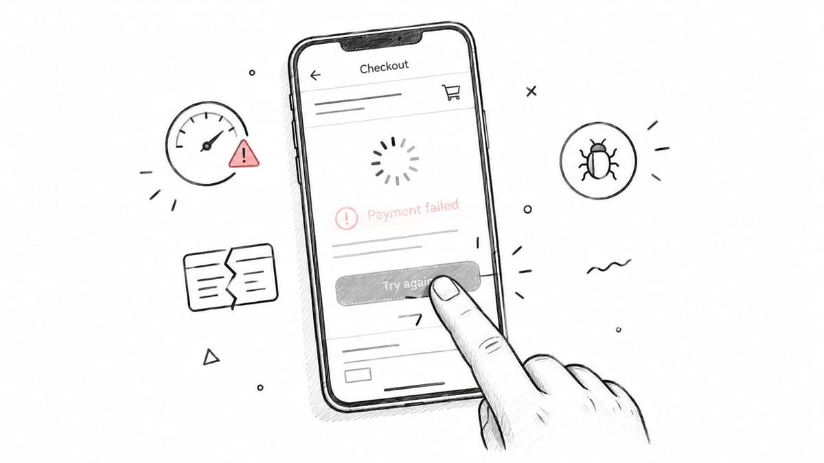
A broken button can look like a low-intent customer in standard funnel reporting. The shopper reaches payment, taps Pay, receives no useful response, and leaves. Baymard reports that 14% of users may abandon when a phone number is required without an explanation, while 72% of sites make credit-card expiration entry unnecessarily difficult. Stripe reports mobile checkout abandonment at 76.98%, compared with 64.78% on desktop, a 12.2-percentage-point difference. Stripe's mobile checkout analysis makes the device gap measurable, not anecdotal.
#Diagnose the failure event
Test the full purchase path on real iOS and Android devices, including Safari and Chrome. Log JavaScript errors, payment declines, coupon failures, address-validation problems, button-render failures, and order-total update errors. Compare sessions that encountered an error with matched sessions that didn't.
A mobile audit should include autofill, keyboard behavior, wallet buttons, coupon entry, and screen rotation. Remove unused apps and scripts from checkout pages, but don't remove a revenue-critical integration without checking its role first. One broken promotion field can create more loss than a slow decorative script.
Fix the transaction failure before polishing the interface. A beautiful checkout still loses every order if Pay doesn't respond.
Compare mobile and desktop completion rates by browser and payment method. A large gap on one browser may point to compatibility rather than general mobile UX. Review browser compatibility issues when the failure appears concentrated in a specific environment. Arlo's weekly report can help prioritize mobile and desktop gaps by estimated revenue impact.
#8. Unclear Returns Policy and Lack of Guarantees
A buyer can want the product and still decide the risk is too high. This is common for apparel, footwear, gifts, and higher-priced products where the customer can't fully judge fit or suitability before delivery. Baymard-based research reports that 16% of abandoning shoppers cited an unsatisfactory returns policy, making returns a distinct trust issue rather than a general checkout objection.
#Confirm risk-based abandonment
Compare exits for new and returning customers, especially near the payment step. Review support conversations that mention sizing, exchanges, refund timing, or return postage. If shoppers open the returns page and then leave, the policy may be answering the wrong question or presenting the cost too late.
Put a short summary beside the add-to-cart button and again at checkout. State the return window, who pays shipping, and whether exchanges or store credit are available. Link to a full policy written in plain language. Don't hide restrictive terms in a dense legal page after the shopper has committed time to the order.
Offer exchanges or store credit when they protect margin and genuinely serve the customer. Track return reasons by SKU and size, then improve product measurements, photography, or descriptions when the same confusion repeats. A clear policy won't fix a product that customers consistently misunderstand.
#8-Point Checkout Abandonment Comparison
| Item | 🔄 Implementation complexity | ⚡ Resource requirements | 📊 Expected outcomes | 💡 Ideal use cases | ⭐ Key advantages |
|---|---|---|---|---|---|
| Unexpected Extra Costs at Checkout (Shipping, Taxes, Fees) | Moderate, integrate shipping/tax calculators and UI | Moderate, carrier/tax APIs, dev time, possible margin trade-offs | Higher conversion and AOV; fewer late-stage abandonments | International sellers, high-shipping-cost products, stores optimizing AOV | Builds trust; filters poor-fit shoppers; boosts order value |
| Forced Account Creation | Low, change checkout flow and post-purchase prompts | Low, UI changes, email capture, analytics | Higher first-time conversion; fewer abandonments at checkout | One-time purchase stores, mobile-first shoppers | Removes friction; preserves recovery via post-purchase account offer |
| Slow or Unclear Delivery Timelines | Moderate, integrate carrier ETAs and display dates | Moderate–High, carrier data, fulfillment alignment, operational changes | Fewer time-sensitive abandonments; improved satisfaction | Gifting, urgent-delivery categories, geographically distributed customers | Reduces uncertainty; captures expedited-purchase demand |
| Payment Trust and Security Concerns | Low–Moderate, add trust signals, maintain domain/design consistency | Low, wallet integrations, SSL/certificates, payment-provider setup | Higher completion at payment; fewer chargebacks/refunds | New or lesser-known brands, stores converting first-time buyers | Increases perceived safety; leverages recognized payment brands |
| Long or Complicated Checkout Process | Moderate, UX audit, form reduction, single-page/accelerated flow | Moderate, dev work, validation, autocomplete/address API | Higher completion rates; fewer input errors | Sites with high form-dropoff, mobile-heavy traffic | Reduces friction; faster checkout; measurable conversion lift |
| Limited Payment Options | Low–Moderate, add wallets, BNPL, regional methods | Moderate, provider onboarding, reconciliation, fees | Improved mobile conversion; higher AOV for big-ticket items | International stores, mobile shoppers, high-ticket products | Faster checkout on mobile; BNPL increases affordability/AOV |
| Technical Errors and Mobile Checkout Friction | Moderate–High, cross-device testing, bug fixes, performance tuning | High, QA, monitoring, developer time, session-replay tools | Quick measurable gains when fixed; better mobile conversion | Stores with mobile-desktop gaps or intermittent failures | Often fast ROI from fixes; stabilizes checkout across devices |
| Unclear Returns Policy and Lack of Guarantees | Low, clarify copy and surface policy in UX | Low–Moderate, legal review, returns process/ops adjustments | Higher conversion; reduced purchase anxiety (may ↑ returns) | Apparel, footwear, higher-priced or fit-sensitive items | Low-friction trust signal; differentiator that lowers hesitation |
#Turn the Diagnosis Into Your Next Checkout Sprint
Don't begin by redesigning the entire checkout. Begin with the store's own evidence.
Pull checkout drop-off by step, device, geography, cart value, customer status, and payment method. A payment-step exit means little by itself. Pair it with the event that happened immediately before the exit, such as a shipping-rate display, account prompt, payment decline, validation error, or delivery-date view.
Then match the pattern to one or two reasons from this list. If exits cluster after shipping appears, investigate landed-cost disclosure. If guest shoppers disappear at registration, remove the account wall. If mobile users fail after tapping the payment button, inspect the device and gateway logs before changing copy or pricing.
Choose one fix with a clear diagnosis and a measurable outcome. Write down the affected funnel step, the relevant segment, the conversion metric, and the average order value you'll monitor. Keep the test focused. Changing shipping, payment methods, form length, and returns messaging at the same time makes it impossible to know which intervention helped or hurt.
A useful order of operations is:
- Restore function first: Fix failed transactions, broken buttons, silent errors, and payment declines before optimizing persuasion.
- Remove high-impact uncertainty: Expose shipping, taxes, delivery dates, returns terms, and payment security at the point where the buyer needs them.
- Reduce unnecessary effort: Offer guest checkout, autofill, wallets, concise forms, and a clear recovery path after failed payment.
- Measure commercial effects: Watch conversion rate alongside average order value, margin, refunds, and support contacts.
Don't assume every abandoned session is recoverable. Baymard reports that 42% of U.S. shoppers abandoned because they were browsing or weren't ready to buy. After excluding that group, unexpected costs were cited by 40%, slow delivery by 20%, payment-security concerns by 19%, forced account creation by 18%, and checkout complexity by 17%. Baymard's current state of checkout UX shows why intent matters. A low-intent visitor may need saved carts, product education, a price-drop alert, or a later reminder. A high-intent shopper who reaches payment needs a friction-specific fix, not an automatic discount.
Ship one change, measure it against conversion rate and average order value, then move to the next leak. Arlo's weekly report ranks checkout and conversion action items by urgency and estimated dollar impact, so your next fix can come from store data rather than a generic list.
Arlo turns Shopify sales, traffic, customer, and product data into a concise weekly report that identifies checkout issues, explains what changed, and ranks actions by urgency and estimated dollar impact. Visit Arlo to connect your store and make the next checkout fix more specific.