
How to Build a Data Analytic Dashboard for Your Shopify Store
By Arthur Falcone · Founder of Arlo
You've probably got Shopify open in one tab, Google Analytics in another, Meta Ads in a third, Klaviyo in a fourth, and maybe a spreadsheet trying to glue the whole mess together. You're checking numbers constantly, but you still can't answer the only question that matters: what should I do next?
That's the trap. Most founders don't have a data shortage. They have a decision shortage.
A good data analytic dashboard isn't another place to stare at charts. It's a small, sharp operating panel that helps you make better revenue calls faster, then close the laptop and get back to merchandising, creative, retention, and inventory.
This post is the setup layer of our complete Shopify marketing analytics guide: what goes on the panel and how to build it. For how to read it week to week once it exists, see using ecommerce analytics day to day.
#Table of Contents
- Why Your Current Analytics Isnt Working
- What Is a Data Analytic Dashboard Really
- The Core Components of an Effective Dashboard
- Essential Metrics for Your E-commerce Dashboard
- Designing a Dashboard That Actually Works
- From Signals to Strategy How to Act on Your Dashboard
- The Goal Is Insight Not Another Dashboard
#Why Your Current Analytics Isnt Working
Your current setup probably wasn't built to help you decide. It was built by separate tools that each want to be the center of your world.
Shopify wants you looking at store sales. Meta wants you looking at campaign results. Google Analytics wants you exploring traffic behavior. Klaviyo wants you inside flows and campaign reporting. None of those views is wrong. They're just incomplete, and founders get punished by incomplete views.
The core issue isn't that you need more dashboards. It's that you need fewer interpretations competing for attention.
#Default dashboards reward checking, not deciding
Most built-in analytics screens are activity traps. They give you plenty to click and plenty to compare, but they don't force prioritization. You end up reacting to whatever looks dramatic instead of what changes profit.
That's how founders waste a week chasing the wrong problem:
- Traffic is down: so you assume acquisition broke.
- Revenue is flat: so you cut ad spend.
- Returning customer sales slipped: so you blame email.
- Conversion dipped: but the actual issue was mobile checkout friction.
A messy analytics habit creates fake urgency. You see movement everywhere, so everything feels important.
Practical rule: If your analytics review produces more tabs than decisions, your system is broken.
#The problem is interpretation
Raw numbers don't tell you what to do. They only tell you where to look.
A useful data analytic dashboard cuts across tools and narrows attention. It answers simple operating questions fast. Is the store healthy? Where did the change start? Which lever matters most right now? That's what founders need.
You don't need a dashboard that proves you're data-driven. You need one that helps you choose between fixing mobile conversion, reallocating budget, pushing bundles, or cleaning up retention flows.
That means your dashboard has one job: turn noise into signal.
#What Is a Data Analytic Dashboard Really
A report tells you what happened. A dashboard helps you manage what's happening.
That difference matters more than most founders realize. A report is static. You read it, maybe forward it, then move on. A data analytic dashboard is interactive. It pulls data from different systems into one place so you can spot a shift, filter the view, and ask the next question without opening five more tabs.
#A dashboard is for driving
Think about your car dashboard. It doesn't show you every sensor, part number, or engine schematic. It shows the small set of indicators you need to drive safely and react quickly. Speed. Fuel. Warnings. Direction.
That's how your business dashboard should work too.
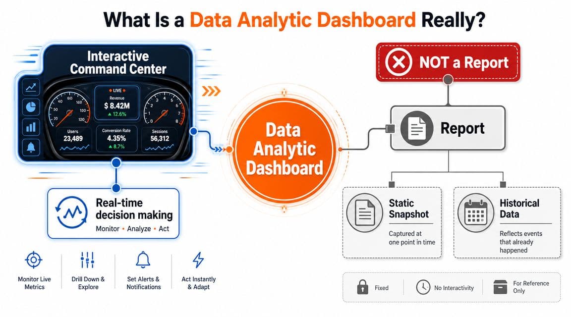
A useful dashboard isn't a museum of every metric your tools can export. It's an operating surface for making decisions while the business is moving.
A key shift in analytics over time was the move from static reporting to interactive dashboards that consolidate multiple data sources into a single real-time view, with charts, graphs, tables, filters, and drill-downs so users can monitor KPIs, compare periods, and explore what's driving performance changes, as outlined in Qlik's overview of analytics dashboards.
#What founders should expect from it
You should expect three things from a data analytic dashboard.
First, consolidation. Your sales, traffic, marketing, and customer signals should sit together. If you need three logins to explain one problem, the dashboard isn't doing its job.
Second, interactivity. A number changed. Fine. Now slice it by device, channel, product, or customer type and find the likely cause.
Third, decision support. The dashboard should make the next move clearer. Pause spend? Push best sellers? Fix a landing page? Audit retention? If the answer is still murky, simplify the dashboard.
If you want a practical companion to this way of thinking, ECORN's piece on Strategies for eCommerce performance is worth reading because it ties dashboard thinking back to actual store operating decisions instead of just reporting mechanics.
#The Core Components of an Effective Dashboard
Most bad dashboards fail for a simple reason. They mix up ingredients and purpose.
An effective data analytic dashboard has a few core parts, and each one has a specific job. If you understand those jobs, you stop asking your dashboard to do everything at once.
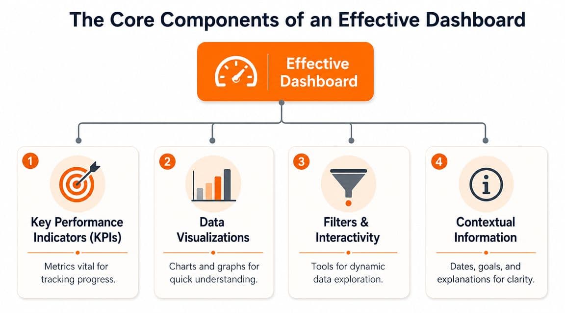
#KPIs are the gauges
KPIs are the top-line numbers that tell you whether the business is healthy. They should answer the first scan questions fast.
Good KPI slots usually cover:
- Revenue health: Are sales moving in the right direction?
- Acquisition efficiency: Are you buying customers at a sensible cost?
- Conversion strength: Is traffic turning into orders?
- Retention quality: Are customers coming back?
The mistake is stuffing the top row with trivia. If a number doesn't change a business decision, it doesn't deserve prime placement.
#Charts, tables, filters, context
Charts show patterns. Tables show detail. Filters reveal causes. Context stops you from misreading everything.
Here's the cleanest way to think about each component:
| Component | Job | Founder use |
|---|---|---|
| KPI cards | Show current status | Fast health check |
| Line charts | Show movement over time | Spot trend breaks |
| Bar charts | Compare categories | See channel or product gaps |
| Tables | Show exact values and rows | Audit specific campaigns, SKUs, or segments |
| Filters | Narrow the lens | Check device, geography, date range, cohort |
| Context notes | Explain what you're seeing | Avoid bad decisions from incomplete reads |
A line chart is for trend direction. A bar chart is for comparisons. A table is for inspection. Don't use one element to do another element's job.
Founders get into trouble when they stare at blended averages. Averages hide where the leak actually is.
The importance of filters is often underestimated. Without them, you get one blended business view. With them, you can isolate paid social, mobile users, first-time buyers, or repeat customers and see what changed underneath the headline number.
And context is essential. A chart without date range, benchmark, or segment label is a fast path to dumb decisions.
#Essential Metrics for Your E-commerce Dashboard
Most founder dashboards are bloated with vanity metrics. They look busy and feel advanced, but they don't help you choose the next action.
The fix is simple. Organize your dashboard around the decisions you make every week, not around the reports your tools happen to generate.
#The questions that matter
Your metrics should answer four practical questions.
Is the business healthy?
You need a top-line view of revenue, orders, and the mix between new and returning customer revenue. That tells you whether growth is coming from acquisition, retention, or a temporary spike that won't last.
Are we acquiring customers efficiently?
Look at channel-level traffic and paid performance alongside sales outcomes. Don't stop at clicks. Founders lose money when they celebrate cheap traffic that doesn't convert.
Is the site converting?
Storewide conversion can hide a bad mobile experience, a product page issue, or checkout friction. Break it down by device and landing page type.
Are customers coming back?
If repeat behavior weakens, paid acquisition has to work harder to cover the gap. That usually gets expensive fast.
For a broader view of how analytics should support commerce decisions, this guide to analytics in ecommerce is a useful follow-up.
#Key e-commerce dashboard metrics
Here's the short list I'd put in front of most founder-led brands.
| Metric | What It Answers | Why It Matters |
|---|---|---|
| Revenue | Is the store growing or shrinking right now? | It's the first business signal, but never enough on its own |
| Orders | Is sales movement coming from more purchases or just bigger baskets? | Helps separate demand from pricing or AOV shifts |
| Average order value | Are customers buying more per order? | Useful for merchandising, bundles, and discount strategy |
| Conversion rate | Is traffic turning into purchases? | Exposes site friction and traffic quality problems |
| Conversion rate by device | Is mobile or desktop underperforming? | Helps you find hidden UX issues |
| New customer revenue | Are acquisition efforts producing first purchases? | Tells you whether top-of-funnel work is translating into sales |
| Returning customer revenue | Are existing customers still buying? | Signals retention strength and brand stickiness |
| Traffic by channel | Which acquisition sources are actually feeding the store? | Helps budget allocation |
| Revenue by channel | Which traffic sources create sales, not just visits? | Prevents over-crediting weak channels |
| Top products | Which SKUs are pulling demand? | Guides inventory, merchandising, and creative focus |
| Landing page performance | Are key entry pages doing their job? | Finds broken or weak first-touch experiences |
| Email flow revenue | Are automated retention systems contributing? | Useful for diagnosing lifecycle gaps |
| Cart abandonment trend | Are shoppers dropping before purchase? | Points to pricing, shipping, or checkout friction |
| Cohort behavior | Are customer groups performing differently over time? | Helps retention strategy and offer design |
Don't put all of these on the first screen. Some belong in drill-down views. The homepage of the dashboard should only hold the metrics you need for a daily or weekly executive scan.
A good founder dashboard doesn't answer every question immediately. It answers the first one fast and makes the second one easy.
#Designing a Dashboard That Actually Works
Most dashboard problems are design problems. Not visual design. Decision design.
A cluttered dashboard doesn't just look bad. It slows judgment. That's expensive when you're trying to decide whether to change spend, fix a funnel leak, or push a product.
#Keep it brutally focused
Good dashboard guidance is clear on one point. Keep the KPI count tight.
A widely used benchmark is 5 to 15 metrics maximum, with many best-practice guides tightening that to 5 to 9 key metrics on a single screen, and a practical trend window many teams use is 30 days to spot directional movement without drowning in noise, according to Domo's analytics dashboard guidance.
That's the rule I'd use. For the main screen, stay closer to the lower end.
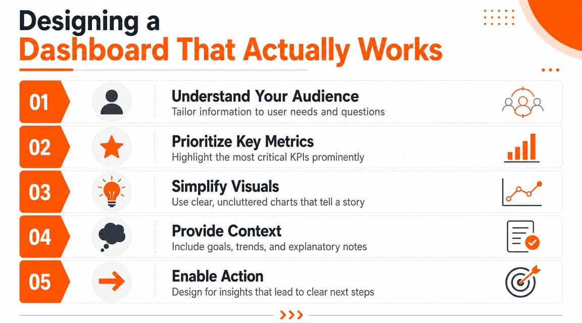
If you're trying to support every function on one screen, you'll end up helping nobody. Build for the operator making weekly revenue decisions. Everyone else can have a secondary view.
A related habit is mapping the dashboard to the customer path. This article on the customer digital journey is helpful if you want your reporting to reflect how buyers move from visit to repeat order.
#Design for speed not decoration
Use layout like you'd use shelf placement in a store. Put the most important thing where the eye lands first.
I'd structure it like this:
- Top row for executive KPIs: revenue, orders, conversion, new versus returning mix.
- Middle row for trends: short time-series views that show whether movement is real or random.
- Lower section for diagnosis: device, channel, campaign, product, and cohort cuts.
- Bottom area for detail tables: useful, but never the hero.
Here's a solid visual walkthrough if you want to see dashboard design principles in action.
A few hard rules matter:
- Use one clear date range: if one chart shows a week and another shows a month, people misread the story.
- Match chart type to question: trends get lines, comparisons get bars, detail gets tables.
- Label segments clearly: “mobile” and “desktop” are useful. “segment A” is useless.
- Fix data quality first: a polished dashboard built on broken tracking will mislead you faster.
Operator's rule: If a dashboard makes you explain it every time someone opens it, redesign it.
#From Signals to Strategy How to Act on Your Dashboard
The pitfall for teams lies in monitoring without subsequent action.
A dashboard tells you what changed. Revenue management starts when you translate that change into one concrete move. I like a simple flow: observe, diagnose, act, execute.
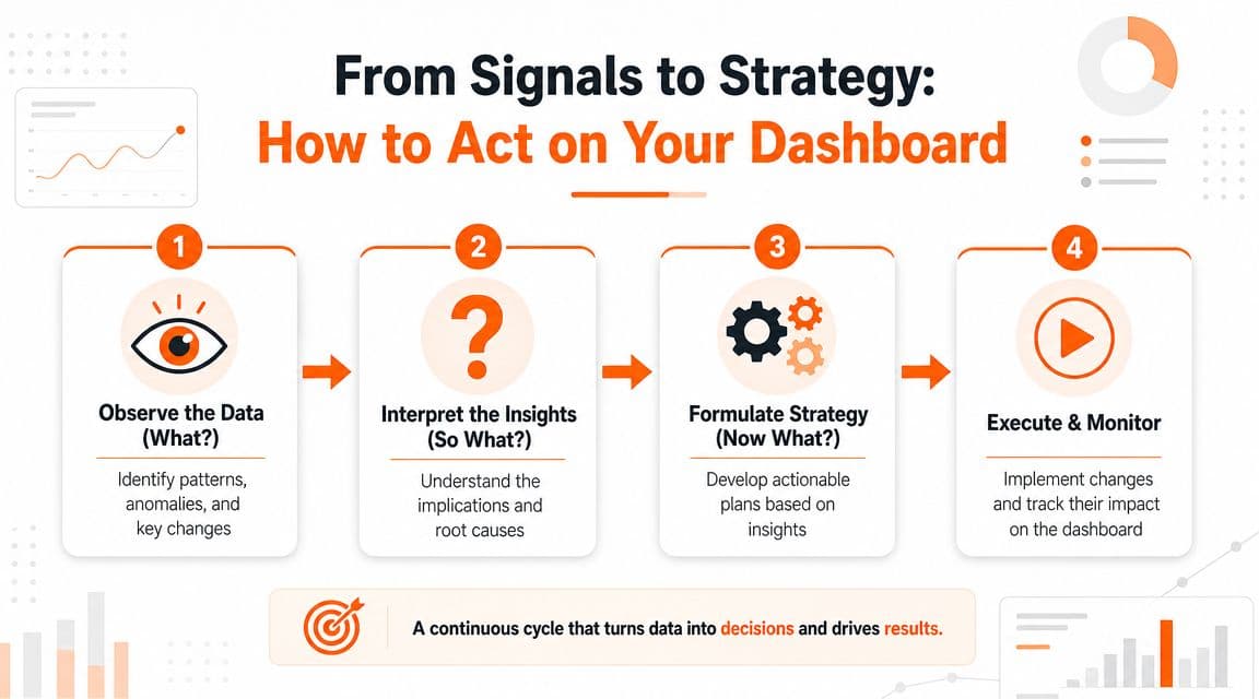
#Use observe diagnose act execute
Start with the signal.
Observe
Something moved. Conversion slipped. Returning customer revenue softened. Revenue rose but orders didn't. Don't open ten tools yet. Just define the exact change.
Diagnose
Now narrow it. Check channel, device, geography, product category, customer type, or landing page. You're looking for the smallest useful explanation, not a dramatic theory.
Act
Pick one response tied to the likely cause. If mobile conversion dropped, audit mobile PDPs and checkout. If returning customer revenue weakened, review email flows, replenishment timing, and repeat-purchase offers. If a channel sends traffic but not orders, cut or reshape the spend.
Execute and monitor
Make the change. Then watch the same dashboard for confirmation. Don't mix five fixes together and pretend you learned something.
#Look for gaps between subgroups
This is the piece most founder dashboards miss.
Effective dashboards support root-cause analysis through subgroup analysis, and one broad lesson from dashboard research is that generic top-line KPI views often fail to show the channel, device, or customer-cohort gaps that should change budget allocation or retention strategy, as discussed in this dashboard analysis on subgroup views and root-cause use.
That matters because one blended number can hide a very fixable problem.
Examples:
- Storewide conversion looks stable: mobile is slipping while desktop is carrying the average.
- Paid social looks weak: prospecting is poor, but retargeting is healthy.
- Repeat revenue looks fine: one cohort is buying again, another has fallen off.
- Revenue is growing: one hero product is masking broad catalog weakness.
If you're trying to connect top-line outcomes back to channel contribution, this explainer on the multi-touch attribution model gives useful context for how to think about shared credit across touchpoints.
One dashboard for everyone usually means one dashboard that hides the real problem.
The founder move is simple. Don't ask, “How is the business doing?” Ask, “Which subgroup changed enough to justify action?”
#The Goal Is Insight Not Another Dashboard
You are not hiring yourself to be a full-time analyst. You're running a brand.
That means the win isn't building the prettiest data analytic dashboard in your category. The win is getting to the right insight fast enough to improve revenue, retention, merchandising, and spend decisions while there's still time to matter.
Most founders don't need more chart maintenance. They need cleaner interpretation.
That's why a lot of teams eventually move beyond dashboard-only workflows and add tools that summarize what changed and what to do next. One option is Arlo, which turns Shopify store data into a concise weekly report that explains what changed, why it matters, and which actions deserve attention first.
That doesn't replace the need for a solid dashboard. It changes the role of the dashboard. Instead of being the place you live, it becomes the place you verify, investigate, and confirm.
That's the anti-dashboard lesson. Build a simple one. Keep it focused. Use it to make fewer, better decisions. Then go run the business.
If you want less time in tabs and more clarity on what's actually driving growth, Arlo gives Shopify brands a concise weekly readout of what changed, why it matters, and the next actions worth taking.