
Sales Trend Analysis: A Practical Shopify Guide
By Arthur Falcone · Founder of Arlo
You can feel it before the dashboard finishes loading. Shopify revenue is off, paid social looks softer, email didn't save the day, and your first instinct is to do something fast, pause spend, launch a discount, or blame whatever changed on the platform side. That reaction is common, but it's usually expensive, because the problem isn't “sales are down,” it's “one segment, channel, or cohort changed, and the fix depends on which one.”
Sales trend analysis is the difference between panic and diagnosis. Done properly, it turns a vague revenue dip into a specific answer, then into a decision you can defend with data. The work starts with clean history, careful segmentation, and a habit most founders skip, asking what changed before asking what to do.
#Table of Contents
- Why Most Founders Misdiagnose Revenue Changes
- Collecting and Cleansing Your Sales Data
- Segmenting to Find Where Growth Is Hiding
- Detecting Seasonality and Separating Signal from Noise
- Diagnosing Root Causes and Estimating Dollar Impact
- Automating Your Weekly Sales Trend Review
#Why Most Founders Misdiagnose Revenue Changes
Friday afternoon, Shopify says revenue is down 25% week-over-week. The room gets tense. Someone wants to cut ads, someone else wants a flash sale, and one person blames the algorithm for suppressing traffic. That reaction burns time, because the first move usually targets the symptom instead of the cause.
#The first mistake is treating one week like a trend
Weekly data is noisy. Trend analysis works best when you compare historical sales over time, and a practical baseline is at least the last 12 to 18 months so monthly and quarterly views can separate normal variation from a real shift Outreach guide. One weak week can come from timing, promotion overlap, or a recording issue, and none of those justify a strategic response.
Practical rule: if you can't explain the dip in plain language, you're not ready to fix it.
The second mistake is averaging across too much. Overall revenue can look flat while one product line is climbing and another is slipping. In practice, the useful readout is revenue, win rates, deal velocity, and pipeline coverage over time, because a blended chart hides where the change started. That's the kind of analysis most Shopify teams need before they touch pricing, spend, or inventory Outreach guide.
#The other traps that cost real money
Correlation gets blamed for causation all the time. A campaign may have started before the dip, but that does not prove it caused the dip. Outlier periods create another trap, since a major promotion or a market shock can make a temporary spike look like a lasting shift Outreach guide.
The fifth mistake is skipping the “what changed” question entirely. Good analysis moves from comparison to diagnosis, then checks whether the pattern is structural, cyclical, or just noise NetSuite trend analysis. Founders who skip that step usually fix the wrong lever, then spend two more weeks untangling the fallout.
The cleanest mental model is simple. Start with, “Which segment changed, what moved with it, and what would it cost to reverse that change?” On a Shopify store, that might mean a paid social cohort that stopped converting, a repeat-purchase segment that softened, or a single SKU that dragged AOV lower. I use that framing because it forces the analysis to answer the question that matters most, then lets you estimate the dollar impact before you spend a dollar fixing it. For a deeper workflow on turning revenue changes into a segment-level diagnosis, this ecommerce analytics guide is a useful reference.
#Collecting and Cleansing Your Sales Data
A Shopify store can look weak for the wrong reason. If the export includes test orders, refunds, duplicate records, broken identifiers, or partial channel data, the chart will still look tidy and still point you in the wrong direction. You need a dataset you can trust before you can say anything useful about sales trend analysis.
#Pull enough history to see the shape of the business
For most stores, the minimum useful dataset is 12 to 18 months of order history, because that window is long enough to separate normal variation from a real shift Outreach guide. A few weeks of data is usually just campaign timing, fulfillment noise, and luck. Monthly and quarterly views matter because they smooth the chaos enough to show whether the business is changing.
Shopify's export tools are usually enough for the first pass. Pull orders, customers, line items, discounts, refunds, channel source, and order dates, then keep the record structure clean so you can slice it later by product, channel, customer type, and geography. If those fields do not line up, segmentation turns into guesswork instead of diagnosis.
#Clean the records before you trust the chart
Start by excluding test orders and internal transfers. Then remove duplicate orders, confirm that refunds are labeled properly, and check for missing or suspicious product SKUs and customer IDs. That is not busywork, it is what keeps a fake trend from entering your dashboard.
Mark known events directly in the data. Promotions, launches, outages, and major campaign changes should sit beside the trend line so you can test whether a movement is structural or temporary Snowflake trend analysis. If you do not annotate those moments, every spike will try to tell a different story.
A clean dataset does not guarantee the right answer, but a messy one guarantees the wrong one.
If you are building this process from scratch, keep the workflow simple enough that it repeats every month. A good practical reference for broader ecommerce analytics habits is this guide to analytics in ecommerce, because the same discipline that fixes sales trend analysis also improves channel and product reporting.
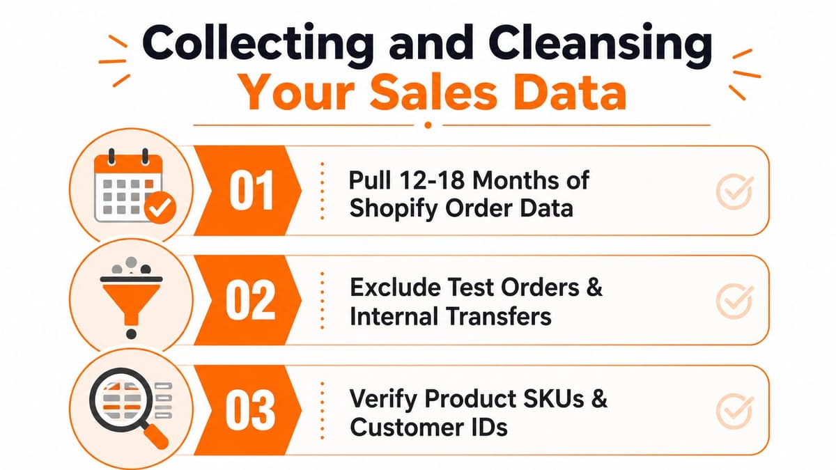
The point of the cleanup is not perfection. It is creating a dataset that is stable enough to support real decisions, instead of a dashboard that changes every time someone changes a filter.
#Segmenting to Find Where Growth Is Hiding
A store can look healthy on the surface while one segment slips and another grows just enough to cover the gap. Revenue analysis gets useful only after you break it into the parts that drive cash.
#Start with the segments that move cash
The first cuts I use are product category, channel, customer cohort, and geography. Those four views usually tell you more than a stack of vanity metrics. If paid traffic is down but email revenue is steady, that points to a different fix than a store where repeat buyers still order and new customers have stalled.
The case for this kind of breakdown is stronger in a large retail market, because company-wide averages blur the problem. Global retail sales are projected to reach $32.8 trillion by the end of 2026, while U.S. total retail sales reached $7.26 trillion in 2024 Gitnux retail stats. At that scale, a single top-line number rarely tells you where to act.
A useful checkpoint is whether a cut shows up where the money is made. A channel, cohort, or region that matters to revenue deserves attention before a low-value slice that looks dramatic but barely moves the business. For a practical framing of how to organize those cuts, see our customer segmentation example.
#Look for underperformance against potential, not against the average
Location and territory cuts help separate weak performance from weak context. A segment matters less because it is down and more because it is down relative to what that segment should be producing. Count's guidance on location-based sales analysis points to the right question, compare local or segment performance against local potential, not just against the store average.
I use a table like this when revenue needs triage:
| Segment Performance Diagnostic Table | ||||
|---|---|---|---|---|
| Segment | Revenue Change | Growth Rate | Dollar Impact | Priority |
| Paid social traffic | Down | Lower traffic or weaker conversion | High if it drives first-time buyers | High |
| Email revenue | Flat or up | Stable repeat behavior | Medium if retention is strong | Medium |
| New customers | Down | Acquisition issue | High if new buyer flow is the growth engine | High |
| Repeat buyers | Flat | Retention holding steady | Lower unless AOV is falling | Medium |
| One geography | Down | Local demand softening | Varies by market size | High if concentrated |
#Rank the work by impact, not by noise
Which segment is large enough to matter? A small decline in a core product line can hurt more than a larger percentage drop in a minor channel. That is why opportunity ranking matters.
Decision rule: fix the segment with the largest credible dollar impact first, not the segment that looks most interesting on the chart.
For stores selling through paid, organic, and email, the fastest wins usually show up where channel mix shifts and customer cohorts behave differently. If new-customer revenue weakens while repeat revenue stays healthy, the issue is often acquisition quality. If one region lags while the rest holds, the problem may be market fit, creative, or shipping friction.
A Shopify example makes the point fast. Overall revenue is flat, but one hero SKU keeps growing while a bundle line falls. The average hides the leak, while the segment view shows the exact product line responsible. That same pattern can show up in a single campaign, a single state, or a single cohort that stopped repeating.
Use this segmentation before you touch bids, discounts, or creative. Otherwise, you end up scaling uncertainty instead of fixing the part of the business that is holding growth back.
For teams that also need to spot emerging social media trends, the same segment-first habit helps separate signal from noise before you spend against the wrong audience.
#Detecting Seasonality and Separating Signal from Noise
A dip in the chart can be pure seasonality, a one-off shipping issue, or the first sign of a real demand problem. A spike can be the same. The job is to smooth the noise first, then decide whether the move deserves action.
#Smooth the line before you trust the shape
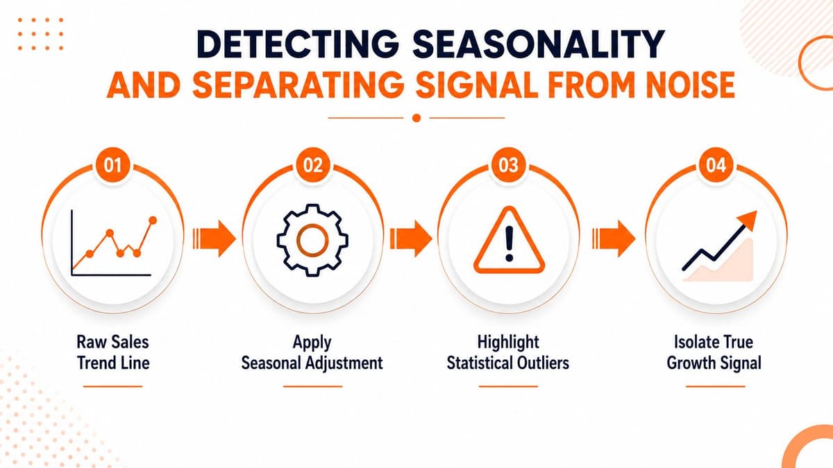
A moving average is the quickest way to strip out short-term noise. One practical approach uses a 3-month moving average to flatten one-off spikes and make the direction easier to read, while another guide shows a 7-period moving average with the spreadsheet formula =AVERAGE(OFFSET(C2,0,0,-7)) Prospeo sales trends analysis. The same source also shows a simple projection formula, =TREND(C2:C90, A2:A90, A91), for estimating the next value from historical data.
If the line is jagged, start there. The point is not to make the graph prettier, it is to expose the underlying direction.
#Compare like with like
Year-over-year comparison is the cleaner way to handle seasonality because it compares the same period against the same period, instead of comparing this month with an unrelated one. That matters most when your store has holiday peaks, launch windows, or recurring promotional events. Monthly and quarterly views still help because they separate normal variation from true trend changes.
24 months of history improves confidence in year-over-year comparisons and decomposition, while a single year gives you only a partial view. If you only have 12 months, you can still identify a pattern, but you should be careful about calling it structural NetSuite trend analysis.
Mark known events in the data, then check whether the dip or spike lines up with them. A holiday surge, a campaign launch, or a fulfillment issue can create a pattern that looks meaningful until you annotate it. That is where many founders overreact to week-to-week fluctuations and end up misallocating spend.
If the movement disappears after smoothing, it probably was not a business problem.
For broader context on how to spot emerging social media trends, the same habit applies. Separate the shift from temporary noise before you spend against the wrong audience.
Use the moving average to decide whether the line deserves attention, then use seasonality checks to decide whether the movement is real. That sequence keeps you from treating every blip like an emergency.
#Diagnosing Root Causes and Estimating Dollar Impact
A trend that looks real on a dashboard still leaves the hardest question unanswered. A founder needs to know which part of the business broke, which part stayed intact, and whether the fix is worth the time.
#Test the cause before you name the fix
Start with the weakest segment and work outward. If revenue is down, compare traffic source, conversion rate, average order value, and repeat purchase behavior before you touch anything else. That sequence keeps you from blaming the wrong lever.
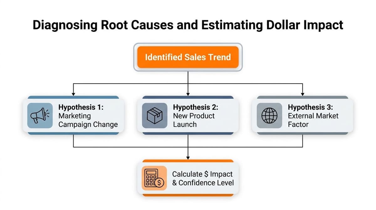
For a Shopify store, the break usually shows up in one of four places, traffic source mix, conversion rate, average order value, or cohort behavior. If traffic fell, the acquisition problem is upstream. If traffic held but conversion slipped, the issue is on-site. If AOV dropped, the basket changed. If repeat behavior softened, retention is leaking.
The fastest way to sort that out is to compare the weak slice against the stable one. If paid social underperforms while email holds steady, the problem is unlikely to be the whole store. If mobile conversion lags desktop, the likely cause is checkout friction, slow load times, or a page that is harder to use on a smaller screen. If only one cohort or one product line is soft, that narrow footprint usually points to a specific change rather than a broad demand problem.
A practical diagnostic flow like the one shown in this root cause diagram for sales trend analysis helps keep the review grounded. Check the segment, verify the likely cause, then confirm whether the move is broad enough to matter.
#Translate the finding into dollars
Revenue impact does not need a fancy model. Estimate how much of total revenue sits in the affected segment, then ask what changes if that segment returns to its prior baseline. That gives you a rough dollar range and a cleaner way to rank the work.
That ranking matters because not every issue deserves the same response. A broken mobile checkout deserves more attention than a creative test. A busted email flow, a product page issue, or a sudden drop in acquisition quality can drain more revenue than a dozen small optimizations. Put the highest-confidence, highest-impact item at the top of the queue.
Practical rule: fix the problem that touches the most money and has the clearest path to reversal.
The approach Snowflake outlines in its trend analysis guidance fits this workflow. Segment by region, product line, cohort, or channel, then turn the movement into a decision about where to spend time first. The action comes after the diagnosis.
For a non-technical founder, the memo can stay plain. State the trend, name the segment, explain the likely cause, estimate the revenue at risk, and choose the next action. That is enough to move a team without burying them in jargon. A weekly growth review works well as the operating rhythm for that kind of decision, because it keeps the diagnosis tied to what changes in the store, not just what changed in the chart.
#Automating Your Weekly Sales Trend Review
A weekly sales review only helps if it runs on a fixed cadence. If the process sits in a spreadsheet you open once a month, the store will usually move faster than your decisions.
#Build a small dashboard that forces action
The weekly review should surface a small set of numbers, not a wall of charts. Revenue versus the four-week average, new customer orders, repeat revenue, email revenue, ad spend efficiency, and the week's biggest leak are enough for most founder-led Shopify stores. Keep the report short enough that someone can scan it before the meeting starts and still know where to look first.
That tight cadence matters because the rest of the stack already produces too much noise. The point is not to prove you have more data, it is to make the next action obvious. A short dashboard gives you room to see whether the drop came from a channel, a cohort, or a product group, then decide whether the revenue loss is small enough to watch or large enough to fix now.
#Set thresholds that tell you when to act
A weekly report should answer one question first, do we need to act now, or just watch? Use one threshold to trigger a review, then set a higher threshold for issues that need owner action the same week. That keeps the team from debating every small wobble while still catching the drops that matter.
The practical cutoff depends on the store, but the logic stays the same. If a paid social campaign, email flow, or product page shifts enough to change weekly revenue in a way you can feel in cash flow, it gets attention. If the move is small and isolated, it stays in the log until it repeats.
Automate the refresh, then automate the summary. Monday data refresh, dashboard generation, alerting on meaningful deviation, then a one-page note that explains what changed and what needs a decision. For a founder who wants a repeatable cadence, the internal guide on weekly growth review is a practical fit because it keeps the review tied to store changes, not just chart movement.
#Document the decision, not just the metric
Keep a short log of what changed, what you decided, and what happened next. That record is where pattern recognition gets better. Over time, you can see which fixes move revenue and which ones only make the dashboard look active.
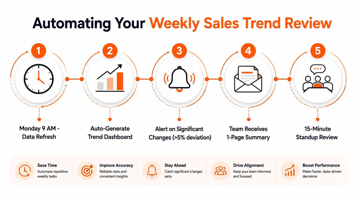
The best weekly review is not long, it is consistent. A calm, repeatable process beats reactive heroics because it helps you catch the right problem early and act before the leak turns expensive.